Software · Web Development
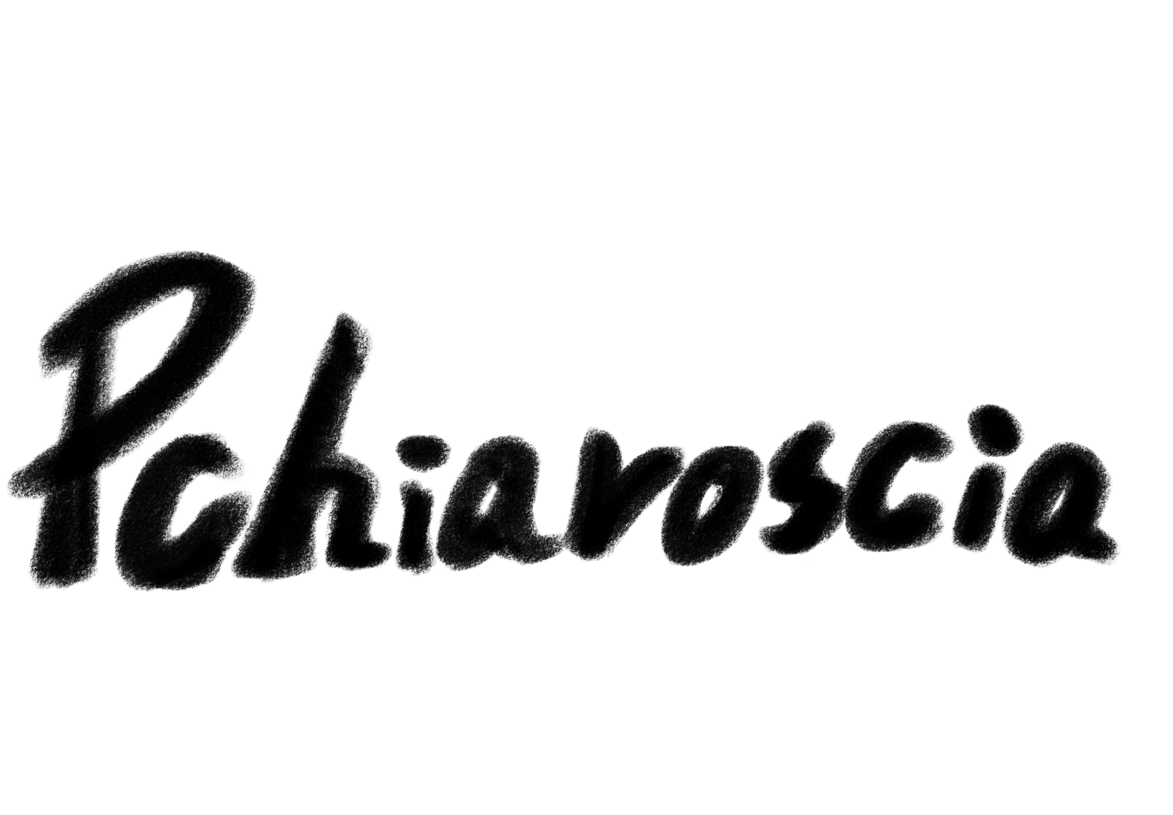
pchiaroscia
A personal website exploring the intersection of technology, photography, and visual storytelling.
Personal website · Web development · Interactive design. Next.js App Router, React, TypeScript, CSS Modules, Tailwind CSS, and Canvas 2D.
The Idea
Project Overview
- Project
- pchiaroscia
- Type
- Personal Website / Independent Project
- Role
- Independent Developer & Designer
- Status
- Ongoing
I independently direct this project, including requirements and scope planning, creative direction and visual design, technology selection, architecture, development, and integration. I also take responsibility for testing, iterative refinement, and ongoing maintenance. I use Codex as a development assistant for code generation and iteration, while directing the decisions, reviewing changes, and integrating the work.
I started pchiaroscia because I wanted a place for the different kinds of work I care about. My interests span programming, systems, language, photography, and visual arts. I wanted the site to grow with those interests, while giving each one room to have its own character.
The project gradually took shape as pchiaroscia, a personal identity that brings together my name, my interest in art and photography, and my fascination with how light creates images and leaves traces behind.
I designed two connected experiences: a Professional portfolio for technical projects, research, and practical problem-solving, and a Creative archive for photography and visual experiments.
That led to a practical design question: how could the same website serve a recruiter or engineer looking for a technical project and a visitor browsing photographs? I kept the technical work easy to navigate and gave photography a more exploratory interface, using familiar objects such as memory cards and film. The site itself could then demonstrate the interaction design and engineering behind the work. Its name gives those two experiences a shared personal starting point.
The Name Behind pchiaroscia
I wanted the name to connect my personal identity with the ideas that draw me to photography and making things. pchiaroscia brings together Pong, Chia, Chiara, and Cia with the Italian words chiaro, scuro, and scia. Some connections appear directly in the letters; others are echoes or references. They overlap rather than dividing the name into separate pieces.
- P
- Pong, my family name.
- CH / CHIA
- CH connects to the beginning of my given name. Chia is a name I have often used, connected to how I combine parts of my Chinese name.
- CHIARA
- My chosen English name. CHIA also begins CHIARA and CHIARO, linking the personal and light-related readings.
- CIA
- Cia is an alias I often use and echoes the ending of my given name. CIA also sits within SCIA.
- CHIARO
- Light, brightness, and clarity.
- SC
- A reference to scuro, darkness and shadow, and to the artistic tradition of chiaroscuro.
- SCIA
- A trail, trace, or wake, carrying the idea of something left behind by movement.
Photography sits at the center of these connections. I am fascinated by the physical role of light in forming an image: how light reaches film or a sensor, and how light entering our eyes makes visual perception possible. A photograph gives that process another relationship with time. It can preserve a trace of a moment that has already passed.
Chiaroscuro brings together chiaro and scuro: light and dark. I appreciate how this artistic technique uses their contrast in photography and painting to give images depth and form. The name’s CHIARO and reference to SCURO connect that artistic influence with my interest in the physical process of image formation.
For me, a trace also means a record of having been here. My photographs, technical projects, relationships, experiences, and ideas are different traces of my existence. This website gathers some of those traces into a place where I can revisit them and share them with others.
A wake suggests something further: movement leaves effects beyond its starting point. I think of ripples in a similar way. A piece of work can become part of someone else’s experience, lead to another idea, or influence something I never get to see. Those effects may be unintended. A trace records something of my own existence; the wider ripples describe how what I do might continue beyond me. The name leaves room for both, without assuming I can know or direct that influence.
The Professional and Creative sides give different kinds of work their own ways to be explored within that shared record. That connection became the basis for the site’s design: distinct experiences, supported by a common identity and structure.
Design & Technical Approach
Because I wanted to keep adding work over time, I needed a structure that would be straightforward to maintain. I chose Next.js App Router so each project could have its own page while sharing navigation and styling. React handles the interactive pieces, and TypeScript helps make the data and state passed between them explicit. I use CSS Modules for detailed component styling and Tailwind CSS for layout and shared utilities.
Most of a case study is simply text and images, so I keep that content server-rendered. The portrait, memory cards, and film objects use client-side components where interaction is needed. This gives each interactive feature its own space without making the whole page depend on its state.
I designed for different ways of visiting the site. The homepage keeps semantic links alongside its decorative portrait, so navigation does not depend on the artwork. The archive offers explicit controls and keyboard interactions alongside dragging, with separate desktop and mobile arrangements and reduced-motion behavior.
Conceptual illustration
I also keep content separate from the interfaces that display it. The selected-work section and project archive share project records, while photography lives in validated collection files. That means I can add a collection or project using the existing structure, without rebuilding the interface around it.
A portrait with a personal origin
The homepage portrait has a more personal starting point: my six-year-old niece, who is in her first year of primary school, drew a picture of me. I later adapted and reworked it for the website. I wanted the result to feel connected to her drawing, even as I explored how to make it interactive.
My initial concept involved particle dispersion and transformations between the Professional and Creative identities. I chose to defer that concept and build the first version from my adapted illustrations using Canvas 2D ASCII rendering. Anticipated rendering cost, implementation complexity, maintainability, and cross-device behavior informed that scope decision. The image-based approach kept the drawing central and gave me a smaller rendering system to develop iteratively. It also introduced a specific challenge: preserving the illustration’s fine, transparent lines while turning them into characters.
From the Darkroom to the Digital Worktable
The Creative Archive’s object-based interface grew out of my experience with photographic processes. During university, I served as president of the photography club. We had a darkroom, but it had been largely inactive for several years. I wanted to bring people back to it and make traditional analogue photography more accessible.
I organised a film photography workshop where participants could develop their own film and make photographic prints in the darkroom. I also introduced affordable black-and-white film developing services and hands-on experiences, priced below typical commercial rates. These activities helped share the craft of analogue photography while generating income for a club facing financial and operational difficulties. They contributed to its continued operation.
That experience is part of why I wanted the archive to feel like a photographer’s worktable. Photography involves handling materials and moving between stages, as well as looking at finished images. I wanted visitors to encounter some of that physical character through a playful, tactile interface they could explore without needing prior knowledge of photographic equipment.
The worktable gives each collection an object that visitors can move and arrange. It suggests a personal photographic workspace, with room to browse and make an arrangement of their own. That freedom also needs a clear starting point and a way back, which led to chronological defaults and Reset Layout.
Digital memory cards connect to a familiar workflow: inserting camera media into a reader to access photographs. Each digital collection becomes a card, and one shared reader provides the entry into its gallery. The metaphor gives opening a collection a physical sequence, while explicit controls offer an alternative to dragging.
Film cartridges introduce film collections through a strip that visitors can pull out before opening the archival sleeves. Developed film would not normally be stored in its original cartridge this way. I deliberately simplified that part of the process to make the interaction engaging and recognisable, balancing real photographic objects with the freedom of a digital interface.
These choices gave the archive its character, but also created engineering requirements: coordinating access to the reader, separating object interactions from gallery state, and preserving arrangements across screen sizes. Alongside the portrait renderer, those requirements became the main technical challenges of the site.
Key Features & Engineering Challenges
Interactive ASCII portrait
Adapting my niece’s drawing into the homepage identity meant preserving its character while making it respond to the two entry points. The renderer needed to retain its tonal detail and remain coherent when someone moved quickly between them. Because much of that detail is carried by transparency, brightness alone would miss part of the illustration. I sample all three images on a shared proportional grid and combine luminance with alpha coverage when mapping pixels to ASCII glyphs. This keeps their positions consistent and the surrounding canvas transparent.
To make transitions reversible, I blend the image samples through soft spatial masks and interpolate toward the active state over time. Character displacement follows deterministic patterns, allowing the same marks to return to their starting positions even after a direction change. Hover and keyboard focus use the same state interface; the links remain independently usable.
I precompute image samples and cache characters in a glyph atlas, avoiding image reads during each animation frame. A pixel budget bounds canvas resolution, and the rendering loop stops when the transition settles or the tab is hidden. Reduced motion applies the selected state without drifting; the source illustration is the static fallback.
The result is an image-driven portrait that can move between identities and return to the original without an abrupt swap. Its fine-line detail still depends on sampling density and display size, so the renderer keeps those settings adjustable within a resolution budget. This is where the artistic goal becomes an engineering tradeoff: keeping the drawing recognizable without rendering indefinitely or increasing resolution without a limit.
Shared digital memory card reader
The shared-reader metaphor required more than animating a card. I had to coordinate insertion, gallery viewing, and ejection so that two collections could not claim the reader at once, while preserving a clear route back to the worktable.
I separated the card’s reusable appearance and flip interaction from collection-specific behavior. Each collection tracks its progression from the table through insertion, viewing, and ejection; the shared reader coordinates access for one card at a time. Dragging and explicit controls enter the same flow, rather than maintaining separate versions of the interaction.
The reader measures current card and slot positions before movement. If scrolling or resizing interrupts insertion, the temporary animation layer is removed and the collection returns to the table. This keeps movement tied to the current layout rather than relying on old screen coordinates. The gallery uses a native dialog, bounded image navigation, and focus restoration to connect viewing back to the opening collection.
Different collections therefore share one coordinated reader and viewer behavior while retaining their own content. The tradeoff is more state coordination than a simple gallery link would require. Keeping presentation, reader ownership, and viewing separate makes that complexity easier to reason about and refine without duplicating the gallery logic.
Draggable Creative worktable
Giving visitors control over the worktable meant deciding how their arrangements should coexist with a useful default. I wanted new visitors to start with recent work and returning visitors to find objects where they had left them. Screen size adds another constraint: a desktop arrangement cannot simply be squeezed onto a phone.
I keep defaults separate from saved positions. The default order uses descending year, then available date, with a stable ID order for ties. The worktable measures its width to calculate columns and initial positions. Moving an object by dragging or keyboard saves relative coordinates in local storage, with independent desktop and mobile profiles. Saved vertical coordinates retain their original row basis so additional rows do not stretch an existing arrangement.
Filtering hides objects without repacking the others. Reset Layout clears saved positions for the current screen profile, including filtered-out collections, and restores the chronological defaults. The other profile remains intact, and unavailable browser storage does not prevent the worktable from functioning.
This gives the archive a predictable starting order and allows a personal arrangement to persist across visits when storage is available. A saved table may no longer look newest-first, because preserving the visitor’s choices takes priority. Reset makes that tradeoff reversible instead of silently replacing their arrangement when the default order changes.
Selected implementation notes
- The server loader and content tools share validation for collection fields, dates, and image references.
- Explicit image lists preserve editorial order; automatic discovery uses natural filename ordering.
Interactive Demonstrations
The examples below use the archive’s actual card and film components with sample notes and empty frames. Try flipping the card, scrolling its notes, or extending and retracting the film before opening the archival sleeves. These demonstrate the object interactions; the complete shared-reader and draggable-worktable flows are available in the Creative Archive.
A card with two faces
Flip the card and explore the scrollable notes on its back. This demonstrates how the object’s face state and notes remain independently usable.
Sample notes and empty frames keep the focus on interaction.
Loading interactive example…
Click or tap outside the notes to flip, or focus the card button and press Enter or Space. The sample’s front has no cover image.
For the complete experience, explore the Creative Archive or try the interactive homepage portrait.
Outcome & What I Learned
The current site brings together technical case studies, a filterable project archive, the Canvas ASCII homepage, and distinct digital and film photography experiences. Film collections use a cartridge, pull-out strip, and archival sleeves, while digital collections use the shared reader. Both sit within a common collection and viewing structure, giving me a foundation for adding work without creating a separate interface for every collection.
One lesson I take from this project is that an expressive interface needs clear rules underneath it. A memory card may look like a small visual object, but using it involves movement, collection state, gallery navigation, and focus. Keeping those concerns separate makes the experience easier to reason about and gives me smaller pieces to test. Keyboard controls and reduced-motion behavior are part of those design decisions, too.
I use automated tests to check image sampling and reversible transitions, collection validation, saved layout behavior, gallery boundaries, focus restoration, and navigation. Lint, TypeScript checks, and production builds provide additional checks as I revise the site. These give me a repeatable way to check the rendering, interaction state, and content rules while continuing to develop the design.
Future Directions
I plan to refine portrait readability, responsive composition, and the transitions between object and gallery views. I also want to use device profiling and accessibility testing to guide further changes, while adding new technical projects and photographic collections.
Particle-based portrait transformations remain a possible future exploration. I would revisit them if they could preserve the illustration’s character and work within the site’s interaction and rendering constraints.
The aim is to keep pchiaroscia open to experimentation without making the work harder to find or the interactions harder to use.
Related technologies
- Next.js
- React
- TypeScript
- Tailwind CSS
- Git
- GitHub